 In my opinion, typography is the most important web design skill. This is the same opinion as the author of the article. Typography is the most important in my opinion as text is usually the main thing users will be looking for on a website. Other things like color, composition and hierarchy make the website look a lot nicer, but the website is still functional without them. But without good typography most websites would be very inconvenient or completely unusable. Text is the primary form of communication for most people using a website, and so bad fonts or small fonts that make it difficult to read a website ruin it completely. Therefore, typography is the most important web design skill.
 A web designer has a very, very important role in making an online business successful. The website is the main hub of an online business, and will be what customers will see the business as. A bad website will ruin all customer experience, and will make sure customers see the business as shoddy. Also, a web designer should be familiar with creating an online business so that they can understand the needs of their customers. Most likely, the websites they will design will be for businesses. If they are not familiar with creating online businesses, that means there are many people who do not need their services. A web designer can provide a lot of help with an online business. If a business is online, than that means their primary means selling items is online too. If a customer is buying from an online store, they will want to buy from an good looking site. If an online store does not look good, then a customer will not want to buy the product, as they will assume the product is also bad or that the business is not professional. Marketing is the same. With an online business, most marketing will also be online, and web designers can help to create attractive advertisements and promotions.
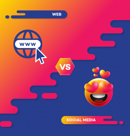 For a business, both a website and social media accounts are important. The biggest advantage of having a website is analytics. With a website, you can get very helpful information that you can't get on social media. Some of this includes the average time spent on the website, how many people buy the product on the website, how many people visit a certain page and more. With a website, the business also has total control over what happens and how to design the page. One disadvantage of a website is having to keep it up and running. It is much harder to keep running than a social media account, and it may require hosting and other costs while a social media account is free.
With a social media account, the biggest advantage is interaction. By interacting with people on social media as a brand account, the business promotes interaction and becomes more popular, as people see the brand as more than just a store selling things. Posting on social media and creating a brand personality can make people relate with the brand, and make them like it more. The biggest disadvantage of a social media account is that the social media company are the ones who decide how much the business can customize the page, and what they can post. In my opinion, social media accounts are a better option. Most people use social media, so you will reach more people, and you can link them to the website on the account page. Promoting interaction is also important, and can help make the business popular.  There are many important considerations to make when designing a website or app, especially what devices the website or app will be used on. Phones are now very popular for browsing the web and using apps, so a good designer needs to make design decisions based on that fact. The two differences between mobile and desktop that I believe are the most important are the difference in screen sizes, and how the different devices are navigated. First of all, screen size. Desktop users are going to be using screens that are much bigger than mobile users. This has many repercussions. This means on mobile, a designer needs to be more careful with what they decide to include on screen, as well as making sure that text, buttons, and images are large enough to be seen. The next difference I believe is very important is how the devices are navigated. Computers are navigated with a cursor controlled by a trackpad or mouse. The cursor is very precise, and can hover over things to bring up more options. Mobiles are controlled by taps and gestures on a touchscreen, which is very different and brings many changes. Buttons have to be bigger on mobile, as a small button is hard to press with a finger. Mobile users can't hover over things like they could with a cursor, and are more dependent on gestures. If these two important considerations are made when designing a website or app for both desktop and mobile, then the users will have a more enjoyable experience.
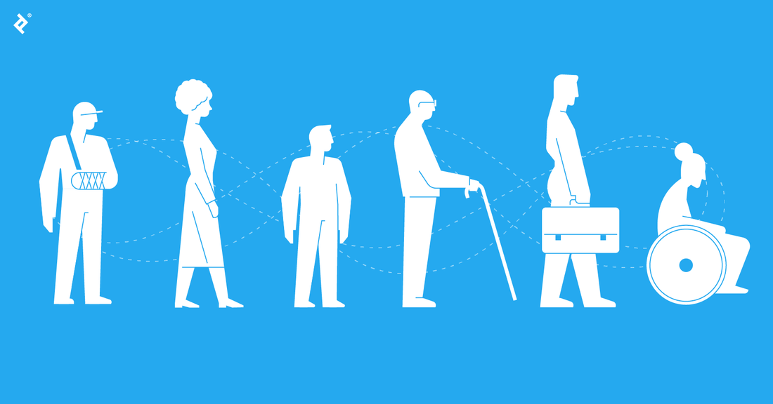 I believe that the three most important tips to inclusive web design are good color contrast, proper and simple gestures, and helping users fix mistakes. First, good color contrast is important because many people struggle to see or are colorblind, so it is important to make sure that even if a user doesn't have good eyesight, they will still be able to read content and interact. Next is simple gestures. By this I mean properly sized and spaced buttons. Having larger buttons and proper spacing makes it easier for disabled and non-disabled users. Finally is helping users fix mistakes. An example of doing this is displaying form errors in real time, which makes it easier for a user who may be confused. These tips are taken from the following article: https://www.creativebloq.com/advice/8-steps-to-inclusive-web-design, and these, in my opinion, are the three most important.
In my opinion, the simplicity of a hamburger menu makes it worth using. The pros far outweigh the cons. The hamburger menu is clean, simple, and recognizable. Most people know what it represents, and what it does. The simple design of the hamburger menu blends in to most website designs. The hamburger menu is also good for things that are not needed on the main page. Some websites use a header with links to different pages of the website on it, but sometimes there isn't space. So, the hamburger menu is a good alternative to hide secondary, less important pages. The article uses Uber as an example. The main page has what is needed to get transportation, and the hamburger menu hides everything else. Google Docs is another example. The main page you first see has recently opened documents and templates, and then pressing the hamburger menu allows you to access settings, Google Drive and other Google apps. The article does name some cons, but I feel that the hamburger menu is so clean and functional that it is worth using on a design.
Shrove Tuesday is the day before Lent for Catholics. For a Shrove Tuesday website, what fonts, color palettes and pictures would work best? To begin, I believe Merriweather would work best as the font. I think this because Merriweather is a traditional serif font, which I think works well for a traditional holiday that marks the beginning of an important period for Catholics. An example of a sentence in the font is below. The color palette below works well in my opinion, because it has more dull background colors, and colors that can be used for elements and accents like light orange and brown. This color palette also matches the image below. The image below is the image I would choose for a Shrove Tuesday site, as it is a photo that shows the tradition of eating pancakes and other sweets on Shrove Tuesday. This makes it a good choice for a Shrove Tuesday website.   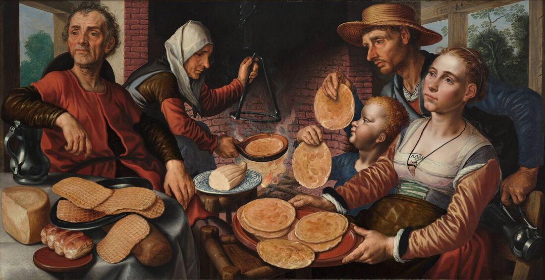 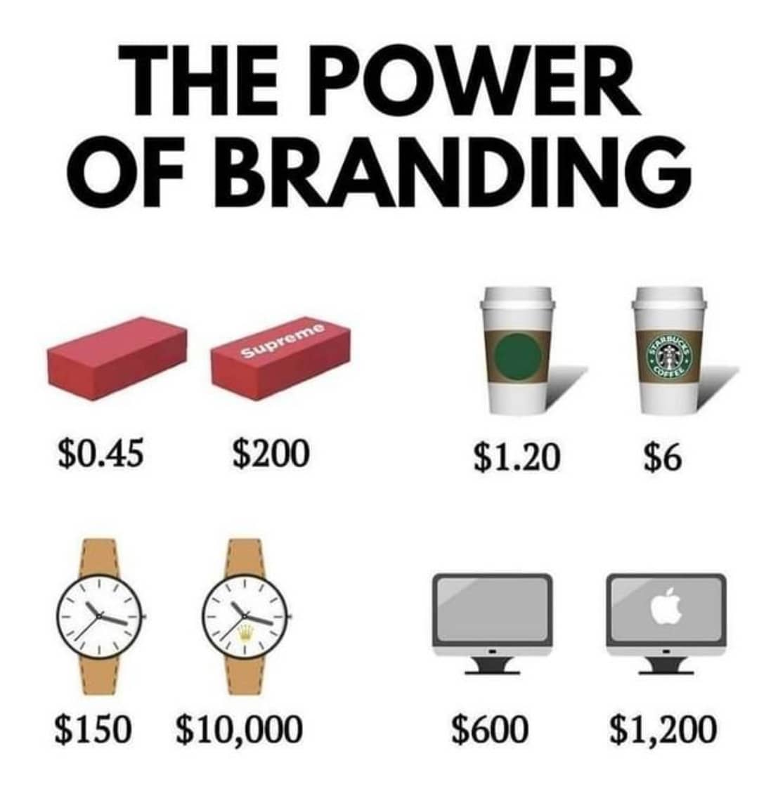 Is creating a brand really important?
Yes, I believe creating a brand is very important. Creating a brand allows for a brand image to be created, and allows people to have a brand to associate the product to. Without a brand, people will not talk about the product as much. As an example, when people are discussing computers, they would most likely be talking about brands of computers and what they provide, rather than computers in general. When most people hear desktop computer, they instantly think of Windows, as Microsoft has created a brand that has become synonymous with computers. This exemplifies why branding is so important, as Microsoft has managed to make people think of their brand whenever they think about computers. Why can't you just sell the product? Selling just the product will not give people anything to talk about or be loyal to. If there is no brand, which means no logo and no name, how will people talk about the product. Usually when people are talking about a product, they talk about the brand behind the product as well. For example, if two people are talking about sneakers, they are most likely talking about Nike sneakers, as Nike has built a brand image around sneakers. There are many other companies that create sneakers, but none are as popular as Nike. As a web designer, do you really have to figure out all the "brand" details first? I believe that in web design it is important to figure out brand details first. This is important because of the way the website is styled. The website must be styled in a way that is relevant to the brand and the type of product they sell. For instance, if a web designer creates a active, sporty clothing company website, and then they later learn that the clothing company sells mostly professional clothing like suits, then the website will not be relevant to the product. The way the brand wants to display themselves is important, so a web designer must ensure that the website they design is accurate to how the brand wants to be shown. Therefore it is important for a web designer to figure out the brand details first. 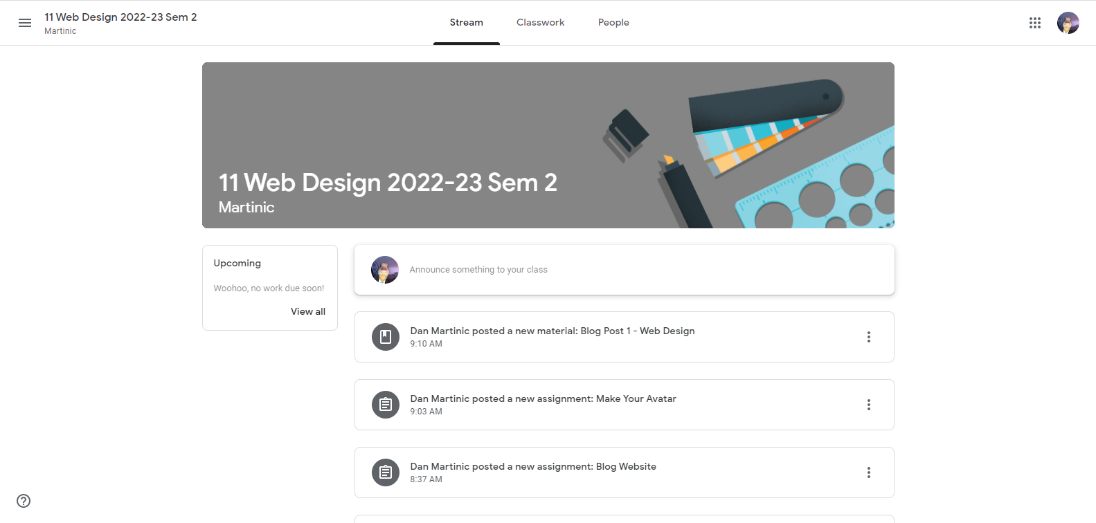 I believe this is a good looking and very functional website. I believe this for many reasons. First of all, important things are put in boxes which are easy to see and differentiate between. This makes it very easy to navigate. The second reason is because of the upcoming work list, which is a very good addition for students, as it allows them to quickly view what work is due soon. Another reason are the tabs that separate different topics, being stream, classwork and people. This is also very convenient and clean looking. A fourth reason this website is good looking and functional is the main page being a stream of the latest posts from the teacher, which is a clean way of organizing it and is functional for students. The colors are also good, and make it easy to read the text. Due to these reasons, I believe this website is good looking and functional.
|
ArchivesCategories |
 RSS Feed
